
Jun 2022 - Dec 2022
Toyota Woven
Product Design Lead, UX Design, Visual Design, Design Strategy, Research
As a senior designer for this project, I was tasked with defining an information architecture for the complete Toyota Woven mobile experience and then focusing design efforts on the pre-purchase experience for customers using the mobile application. The objective was to build an interactive, engaging, and seamless journey that guides prospective customers through the decision-making process, fostering trust, and ultimately, driving sales.
The pre-purchase journey in the automotive industry is traditionally characterized by exhaustive research and comparison, lengthy dealership visits, and paperwork. The digital experience, as it stood, was not adequately supporting potential buyers' needs. Our goal was to simplify this process by providing comprehensive information in an easily digestible format and crafting a pleasant online browsing experience, which mimics the excitement of a physical showroom visit.

In our current digital ecosystems, tasks are segmented into many individual apps, forcing people to think of their processes in silos rather than the needs they want to address. Q Assistant empowers users by freeing common processes into a centralized UI.

A single, elegant feed for commonly repeated tasks and information. A snapshot of how you are using your phone on a daily basis.

Q Assistant surfaces apps and tasks based off of your routine behavior and context.
Quick and intuitive navigation for opened apps and incomplete tasks.
In order to understand people's experiences with their current mobile devices and digital assistants we conducted research through diary study, interviews, and surveys.
Firstly, we wanted to learn their processes for completing tasks throughout their day on their mobile phone. This includes digital routines, commonly used apps, and behavioral trends. How do people use their phone throughout their day simply to get done what they need to get done?
Additionally, we dug deeper into people's interactions with their digital assistants. While digital assistants are popularly used in a home context, we wanted to ask why usage of these assistants is greatly reduced for the everyday mobile experience and what are some of the barriers people face to incorporating it as part of their technology usage?
We discovered several insights:

"I really jump between alot of different apps just to do a couple things. It's like I have my own usage pattern that would seem weird to someone else. I get distracted alot but it feels like that's the cost to using a smart phone these days."
In crafting our design, we defined several values to guide us in considering our interactions. These values acted as guardrails to be intentional with our designs.
Craft focused and legible experiences. Our value derives from respecting people's well being, being mindful of the cost of their attention.
Align with user intentions and be a tool that is task oriented rather than app oriented. Free tasks from app siloes.
Designing to consider our interface as a balance of the scale of our interactions and the value of the information we are providing to people.


I collaborated with visual design to establish our design system. Ensuring that visual and interaction patterns are consistent is very important to develop effective systems not just visually, but systematically as well.

For each task that can be performed by the assistant, flows were created to provide an initial structure for the minimum information needed by the system for a particular flow and the clarifying steps needed to complete the task.

Wireframes are created from the task flows. In the earlier stages of the design, this helped to establish components and patterns that were needed for the design moving forward. This includes lists, forms, summaries, etc.

Once testing of wireframe concepts is complete, visuals are raised in fidelity and continually tested.

Final revisions are refined into the design.

I started by mapping where the MVP ticketing flow was underperforming by highlighting low conversion rates and clear drop-off points in the journey. These insights helped the team see where design could unlock the most impact and guided how we prioritized improvements for the first venue launch.
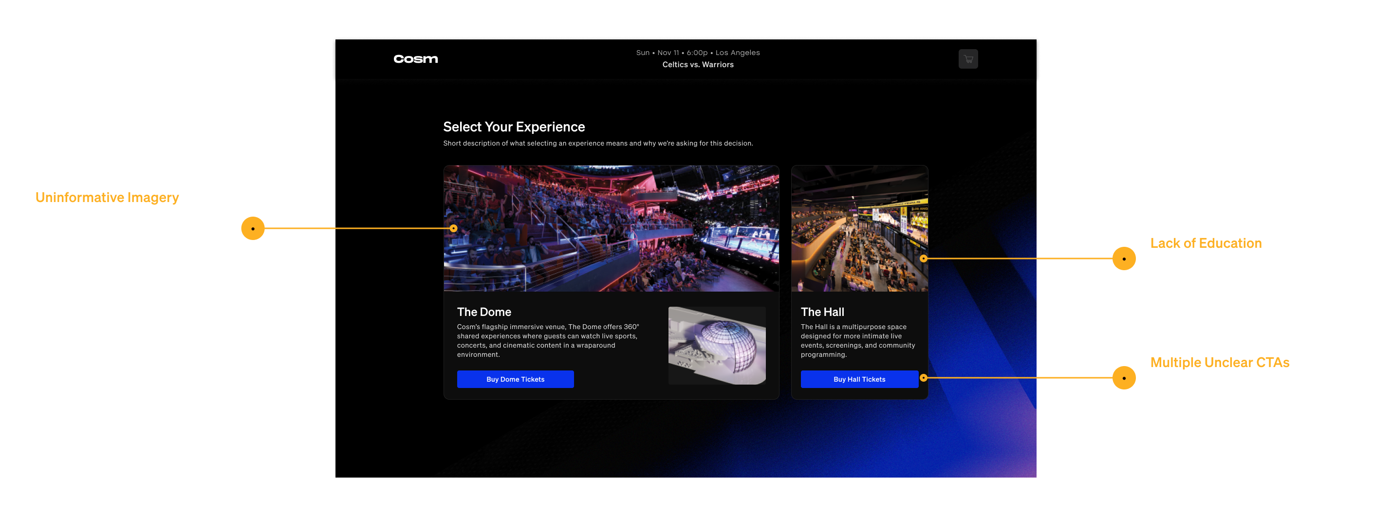

I combined Maze testing with fast “guerilla research,” looping in as many people as possible to quickly spot friction points like Reserve vs. GA flows and validate design decisions under tight deadlines.
Take a picture of me talking on video with someone
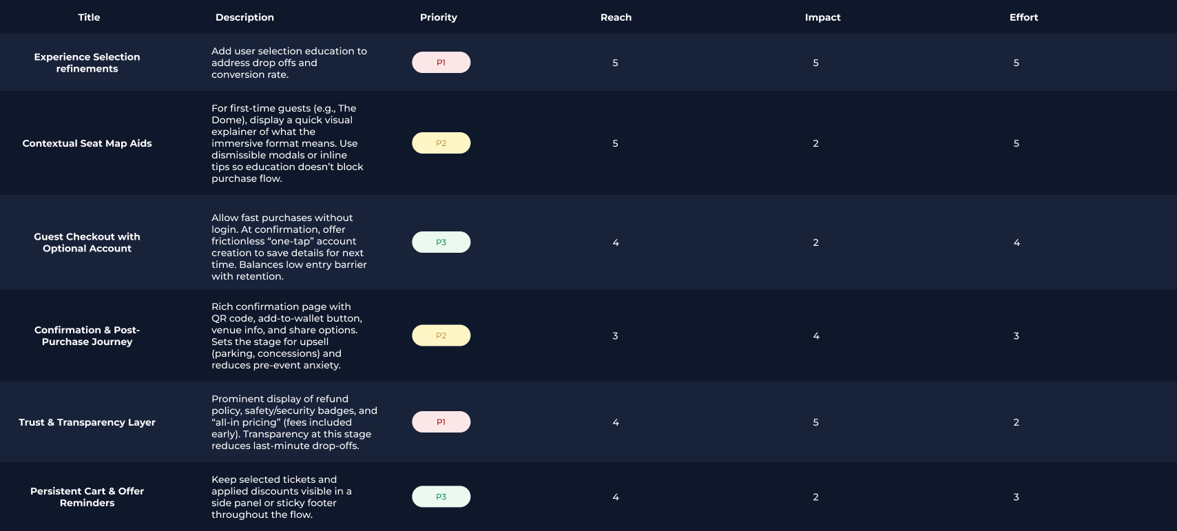
We applied an Impact vs. Effort lens with a Must/Should/Could framework to focus on what mattered most. High-impact fixes were tackled first, complex but critical features like the seat map were prioritized for launch, and lower-value enhancements were deferred — ensuring we boosted conversion while hitting the venue opening deadline.
I led multiple rounds of design exploration for seat maps, experience selection, and checkout flows — testing prototypes and gathering quick feedback to understand what best balanced clarity and speed. Each iteration built on user input and internal alignment, leading to a final flow that significantly reduced friction.

complexity in seat selection on desktop to mobile having those considerations both be j
With a fixed venue opening and live sports events already scheduled, design decisions had to account for immovable deadlines. I drove prioritization conversations across teams, ensuring we delivered a usable, conversion-ready flow at launch while planning for scalable improvements post-opening.
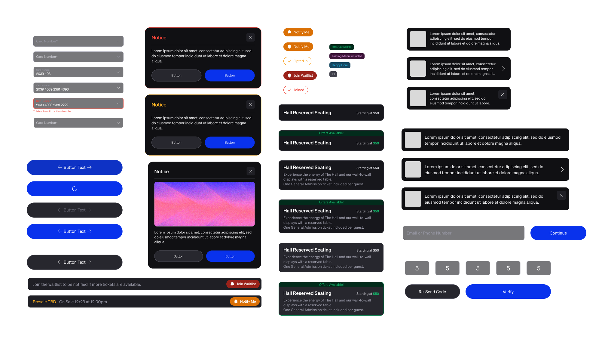
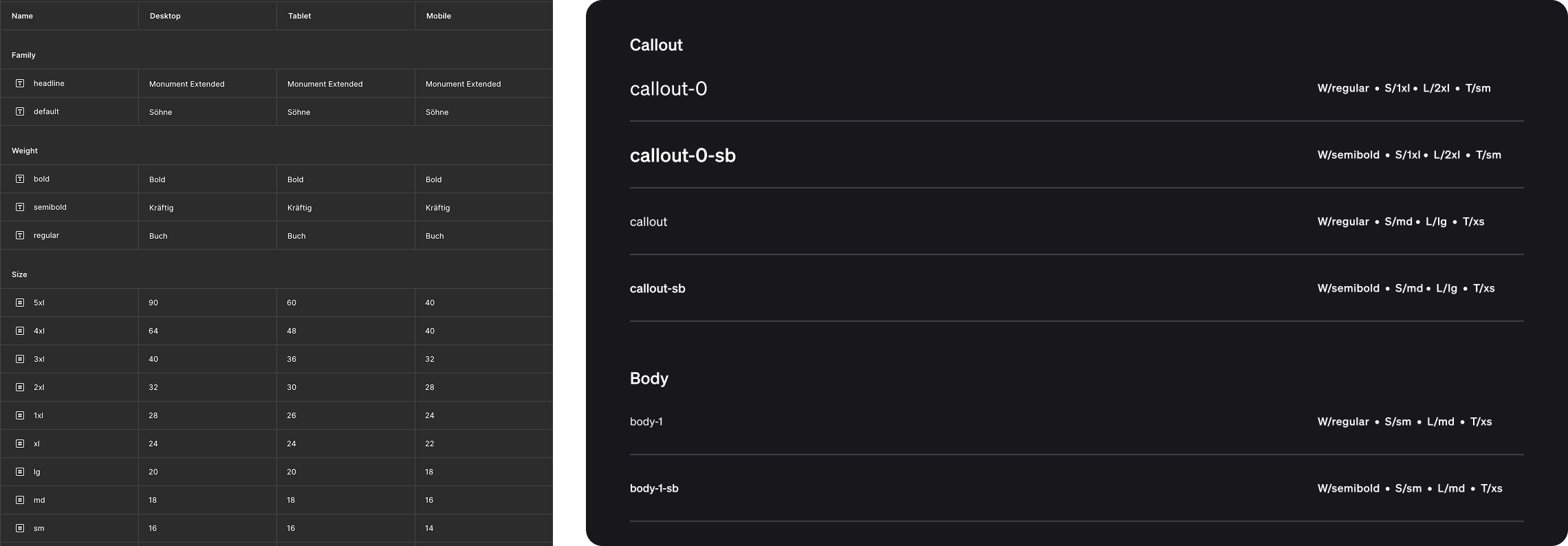
To support speed and consistency, I expanded and refined our design system, building reusable patterns for ticket cards, seat maps, and checkout components. I set up the token system and ensured that our system would support both desktop and mobile experiences with unified text styles.
The redesigned ticketing flow drove a 30% lift in conversion, resulting in over 700K tickets sold and $20M+ in revenue. These outcomes demonstrated how design could directly influence core business metrics at scale.
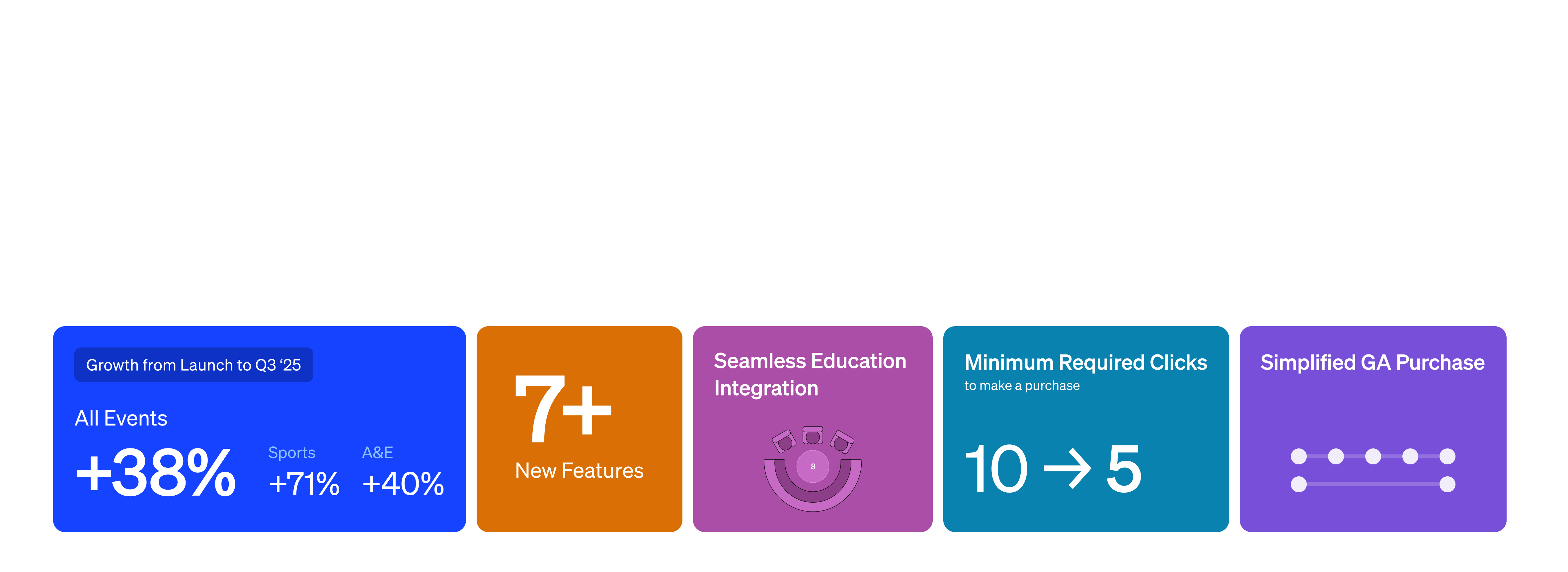
Add an amount of tickets sold and revenue
Our platform had to support the demands of major sports partnerships — not just one venue, but entire leagues, playoff series, and high-volume events. I designed with this scale in mind, extending the design system with reusable patterns for ticketing flows, seat maps, and checkout so they could flex across venues and event types. This approach ensured consistency for guests while giving the business a foundation that could grow with future partnerships.
I worked closely with product to embed design vision into the roadmap, shaping priorities around guest experience rather than just feature delivery. This alignment elevated design’s role in decision-making and created a foundation for more strategic, long-term improvements.

The landing page's primary purpose is to spark interest and inform visitors about AR Core's offerings for Google I/O 2023 and beyond. I crafted it to dynamically communicate AR Core's feature offerings and current uses while generating anticipation. The goal was to showcase AR Core's cutting-edge possibilities while being a pathway to begin using the product for developers.


Showcasing partner brands on the page serves to build credibility and underline the product's industry usage. It also highlights the diverse applications of the AR product, demonstrating its versatility and value proposition through many different real-world implementations.


The community and news sections of our page is a dynamic hub featuring the latest news and hackathon submissions, offering a platform for developers to engage, innovate, and stay informed. This section is crucial as it fosters a sense of community, encourages active participation, and continually showcases the practical, exciting applications of our AR product in the developer ecosystem.
We incorporated a content archive section into our website, recognizing the diversity of sources and topics the website offers. This page empowers users to easily navigate and customize their content experience, ensuring relevant information is always accessible and the wealth of resources is user-friendly and manageable.


I workshopped with the marketing team to organize the types of content as well as the topics under each type of content. We made sure to organize the topics in a scalable way for the future.
In designing the documentation section for our website, I prioritized ease of use, structuring the information to be clear, accessible, and easily searchable. This was intended to provide developers with the resources they need to efficiently develop apps using ARCore, reducing learning curve and boosting productivity.


Given the breadth of overlapping information on the website, I designed the search interaction to highlight how many matches appeared in each collapsing section so users would be able to zero in on not just the information they want, but what topic it is relevant to.
In addition to having search readily available, each page has a summary of the information on the page to make browsing simple and straightforward. Rather than having to search or skim the page, users can navigate to specific information. Additionally recommended content surfaces most searched and new information.


Giving users more in depth information for individual parts of the machine. By interacting in 3D space, partners are more familiar with where parts exist and how it is put into one cohesive whole.


Breaking down the brewing process into narrated chapters simplifies the learning of the steps needed to brew. Voice narration is included to increase learning support mechanisms.
Partners will not feel lost when learning what to do within the experience. Clear directions on how to complete each step.


Given the complex nature of the overall brewing process across multiple methods, simple quizzes at the end of each chapter ensure that partners retain what they've learned.
We broke down our initial research into three sessions.

In the initial evaluation of examining the current state of the cold brew process, Starbucks partners and employees outlined several core insights concerning how people are currently taught to make coldbrew:
After the third session of research, we gathered feedback on our concepts for validation to see what partners felt would best support them learning the new coffee and coldbrew machine. These concepts included interactive puzzles, video support, and more.

After introducing the initial concepts, we asked them to narrow the set of ideas to 3 ideas. We then evaluated these ideas from 1 to 5 in several dimensions.

I created an experience map to consider the whole learning flow of each partner. When it comes to XR experiences, one must take into consideration the interactions that take place before actually hopping into the headset.

Before building the experience, I defined the learning components that were needed for each step. All of the learned processes were to take place with these mechanisms.

After the initial scene anatomy was determined, I storyboarded what interactions would take place in progressing through the learning experience. This included how each step was initiated, user actions to be taken, and any passive moments that would automatically progress the narrative. We collaborated with the Starbucks Innovation Team to write a script that would be helpful, but also fun for the partners. This script was included in the storyboards as well.

Below is an example of part of an interaction moment. Many of these smaller interaction moments make up a full "step" of the coffee and coldbrew process.

I first grayboxed the space in order to get a sense of the size of the space, the components needed, and where the user would stand in the XR experience.

Next, the fidelity was increased by adding materials, lighting, and assets to the scene. We collaborated with the Starbucks Innovation Team to ensure that the space matched the brand perception that Starbucks wanted to maintain.

Interactions were translated from storyboards by building the state machine within Unity.

Due to the use of hand tracking within our experience, we wanted to have embodied interactions within the environment feel as natural as possible (like those used within the brewing process), minimizing "laser pointing" interactions that many XR experiences use.
We firstly prototyped several positions of where the buttons would exist in conjunction with the information panel to ensure there wasn't any visual or physical strain in navigating menus and answering questions.

We also defined button states to more closely align with user mental models of button presses in real life. The challenge here was maintaining natural interactions while also being communicative to the user of how the button would behave.


I began the project by conducting user research involving 15 participants to understand the current role of digital assistants in their lives. Furthermore, I delved into their perceptions regarding how an Assistant tailored specifically for their Facebook experience would behave.
Additionally, I interviewed and led strategy workshops with key stakeholders on the Reality Labs team to discover what some of their vision and pain points were in the development of Assistant as a product.
After synthesizing the information, we arrived at five recurring themes from the research in regards to digital Assistants and more specifically Blue Assistant.

Given the wide set of scenarios and use cases that Assistant would have to handle, I established a set of experiential principles to help us inform and normalize Assistant's behavior across experiences.

The Assistant is a module that operates across a variety of devices, each with unique design systems and interactions. We shifted Assistant's product approach to act as a context-aware layer, meaning it understands the device it's currently on and offers actions based on that understanding. This approach allows the Assistant to adapt its behavior to any device or situation, ensuring its presence is consistent regardless of the context.


The Assistant was not merely a generic digital assistant; it was designed to leverage Meta/Facebook's interconnected user network. Keeping in line with our overarching goal of device agnosticism, we ensured that the Assistant could adapt and function effectively across a variety of devices, thereby maintaining its unique value irrespective of the device context.
For every feature explored, we first began flows and/or architecture. Nailing the conversational interaction was key to ensuring that Assistant was both effective AND efficient at handling user requests within these features.

Assistant analyzes user behavior and preferences to curate personalized content for the home screen. Tailored recommendations enhance user engagement and provide relevant experiences.
Micro-experiences on the home screen, including social interactions, gauge user preferences and behavior. These nuanced insights refine AI-driven recommendations for a personalized touch.

Users can also manually provide signal to what kind of content that they want to see on their home screen experience by directly indicating it.


More content and interactions for desired friends are surfaced by the Assistant on the home page as a result of the signal provided by the user. Giving users some level of control over their recommendations leads to the user feeling more control over their experience.

For each feature, I made sure that we covered multiple scenarios so as to not be prohibitive of what the user would be asking.

Our process was a dynamic process in which ideas were generated, iterated, and prototyped quickly with evaluated ideas that passed our criteria moving forward into research. Ideas were not just put in front of users, but were also "dogfed" to other organizations within Meta. No design was ever fully tossed away, as thoughts and concepts overlapped.


After the designs were shipped there were two main areas that I would have further pursued to continue to refine the features.
While the features were put into user research after implementation, one axis of information that I wanted to further pursue is how usage of these features performed over time. Video calling features can be subject to having a "novelty effect" where first rounds of use are strong, but usage tails off once the feature does not provide a strong enough utility to keep it as a part of user interaction. Gathering that information and understanding how to increase the value to the user would strengthen the feature in the long term.
While the team was able to successfully ship 3 features, there were challenges in balancing the needs of different teams within the Reality Labs organization. As Blue Assistant is a product that touches many products, conversations surrounding how to further Assistant's value were at times at the mercy of other project timelines. With Assistant being further defined as a layer that can exist on top of other products, we created a space where we could bring teams to work together to expand their products.
Our solution was broken down into two main elements.
A Patient Activation tool that increases health literacy to fill the information gap that patients experience upon diagnosis.
A Medication Adherence Tool to provide clear, concise medication adherence information and encouragement for users to maintain their chronic medication intake.

Allows users to tackle their chronic condition in a straightforward and directed way.
Giving users a centralized source for additional resources recommended to them by their clinician.


Having information of each prescription laid out for you in a simple and easy to read layout. Patients will not get confused what prescription is for what symptom or illness.
Giving users a high level view of their medication adherence behaviors. This helps reinforce positive behaviors as well as alert user when they are falling off track. Additionally, this information is given to medical providers to give a more comprehensive view of how patients are doing.

We did discovery by interviewing 12 patients with chronic conditions of all different types. Patients have different ways of managing medication, communicating their diagnosis, and experiencing the mental and emotional load of their chronic conditions. Below are some of the research goals that we wanted to uncover:
Of those insights the three most poignant were:
From those findings, I mapped out a journey map in four phases. that a patient goes through from receiving the diagnosis to managing their conditions. I noted the touch points of when their medical provider is involved as well as areas where Antidote could be a touchpoint.

We also made sure to keep track of the relevant key points to remember in the three phases where we could have the most impact.

I created two personas to capture the types of people that the experience would need to serve. When it comes to medication adherence, we have to account for both people who are careful and considerate of their medication adherence as well as people who may be more negligent in keeping up with their medication regimen.

The onboarding flow shows all of the pathways that the user is able to take to be fully informed on their diagnosis and medicine intake, thus mitigating the feelings of anxiousness from not having all the information needed to begin their chronic care journey.

The tracking and logging flow shows the simplicity of receiving the notification and either logging all medicines simultaneously or individually depending on user preference.

Below is a snapshot of the wireframes that were made for each individual flow.

In depth annotations were made for how each interaction worked. Below is an example of these annotations for the tracking and logging adherence screen. Each interaction on the page supported creating a consistent habit of medication adherence and feedback for users of the experience.

I set up the design system for Antidote to help create more consistent states as well as make the design scalable. Antidote was currently going through a rebrand, so having this in place allows for the product to iterate methodically.

Lastly with all screens, interactions, and states defined, I elevated the wireframes into high fidelity and prototyped the experience.

After completion of the design, we found that with medical adherence and onboarding tool there was a
in usage of the app. With our focus being "Engagement for Health Outcomes" this was a win for the team. Moving forward this engagement with users leads to greater awareness of one's own condition and ultimately a healthier life.
Looking ahead, I would put greater efforts into refining the design system. As no design system was present in the beginning of the project, I made sure to create a"starter" design system so that future efforts to scale the design would be streamlined. One of the challenges we faced was continually iterating upon the design system as Antidote was going through a rebrand at the time of the project. In subsequent projects, I would have pushed on the design system as this would have allowed us to have a more elegant visual execution as well as expand the interactions that were available to us.
Users explore Toyota Woven's vehicle lineup, delve into specific model features, and customize their potential car in an immersive digital environment.


An integral part of the pre-purchase flow was encouraging users to book a test drive, a significant step towards conversion. We optimized this by strategically placing engaging calls-to-action throughout the browsing experience and simplifying the booking process, making it as frictionless as possible to transition from virtual exploration to real-world experience.


Before diving into the pre-purchase experience, I first created a robust information architecture (IA) for the mobile application. This involved organizing, structuring, and labeling the digital space to support discoverability and usability.
The IA was designed to facilitate simple navigation with clear, consistent, and predictable paths. We crafted a hierarchical structure with multiple access points to critical information, ensuring users could quickly and easily find what they needed. Each main category had subcategories that allowed for more specific navigation, creating a detailed and easy-to-follow path.
We tested users on a repeat basis card sorting and tree testing methods to validate our IA, refining it based on user feedback until we had a structure that felt intuitive and natural for users.

Below is a closer look at the pre-purchase part of the defined hierarchy.

An essential part of our UX process was mapping out the user journey, which involved describing the steps a potential Toyota Woven customer would go through in the pre-purchase phase. This process helped us to understand and address user needs, pain points, and moments of delight, enabling us to enhance the overall user experience.

Once we had a clear understanding of the user journey, we translated it into low-fidelity sketches and wireframes, mapping the key points of our journey narrative to screens. These initial design representations served as a blueprint for the pre-purchase experience, allowing us to iterate rapidly, test assumptions, and establish a solid foundation for the user interface before moving on to higher-fidelity designs. It enabled us to lay out the basic structure and flow, ensuring that the user's journey would be smooth, intuitive, and engaging from the onset.

After several iterations of talking to users with the low fidelity sketches, I created a flow to elevate our wireframes into concrete designs. We defined one of our goals to have users engage in a test-drive with their desired vehicle.

Below is a high level view of the wireframe flow created for the pre-purchase experience.

A priority of the pre-purchase experience was to nudge users into taking a test drive. This takes users out of the digital context and into an in-person context, where users will get a better feel for their potential purchase as well as the ability to interface with people. In A/B testing the vehicle detail page we compared whether booking a test drive should be more upfront in exploration of the vehicle or closer to the end.

Users expressed that placing the button to book the test drive too early felt a bit "forceful" and actually discouraged users from wanting to book the test drive through the app. Rather, the opportunity to browse more images to get a better sense of the vehicle before suggesting a test drive felt more "complete" according to users.